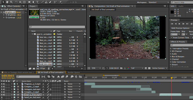
Here are some screen shots of some colour edits I've done over the course of the day...
The image below is the second shot in the post-transformation section. I found that this was a lot lighter in brightness than the pan shot before.
This image is the contrast I have applied in the current draft of the final outcome. Its much higher in contrast and has made the colours look much more vivid and more interesting visually compared to the image below this one....
Also the video below shows a more refined animation for the first third of the animation, including colour corrections and better transitions.
There are still corrections I'd like to make, such as some sort of blurring at the edges of the antagonist attack frame. This way it will focus the audience's attention on the antagonist's approach and also the mask. Also there are couple of shots that need to be elongated such as the antagonist moving around the tree. There isn't enough time for the audience to take in the information. I may try the freeze frame technique I used on the blink test.


No comments:
Post a Comment